Simulator Improvements: Phase 2 Report
Status: passed
This blog summarizes the work done for the second phase evaluation of the Google Summer of Code program under the organization CircuitVerse as a part of the “Enhancing Simulator User Interface” project.
Project 1: Color Themes

Overview:
This Project aims to bring themes to the CircuitVerse’ Simulator application. The main inspiration for this project is to let users have options for the look & feel of the interface that they work on, one main aspect of this project is to make the simulator usable, more accessible to the color blinded users.
As the current theme of the simulator wasn’t made on a color-blind color palette. The Project has completed bringing in about 5 different color themes & 1 specially curated theme for the color blind. There is a plan to extend this feature to let users generate their custom-made theme for leveling up the user customization to a very high end.
Status: completed
Description:
Before getting my hands dirty on the code editor, I initially started researching the world of colors. Turns out people that view & people that create have a different perspective about what is seen.
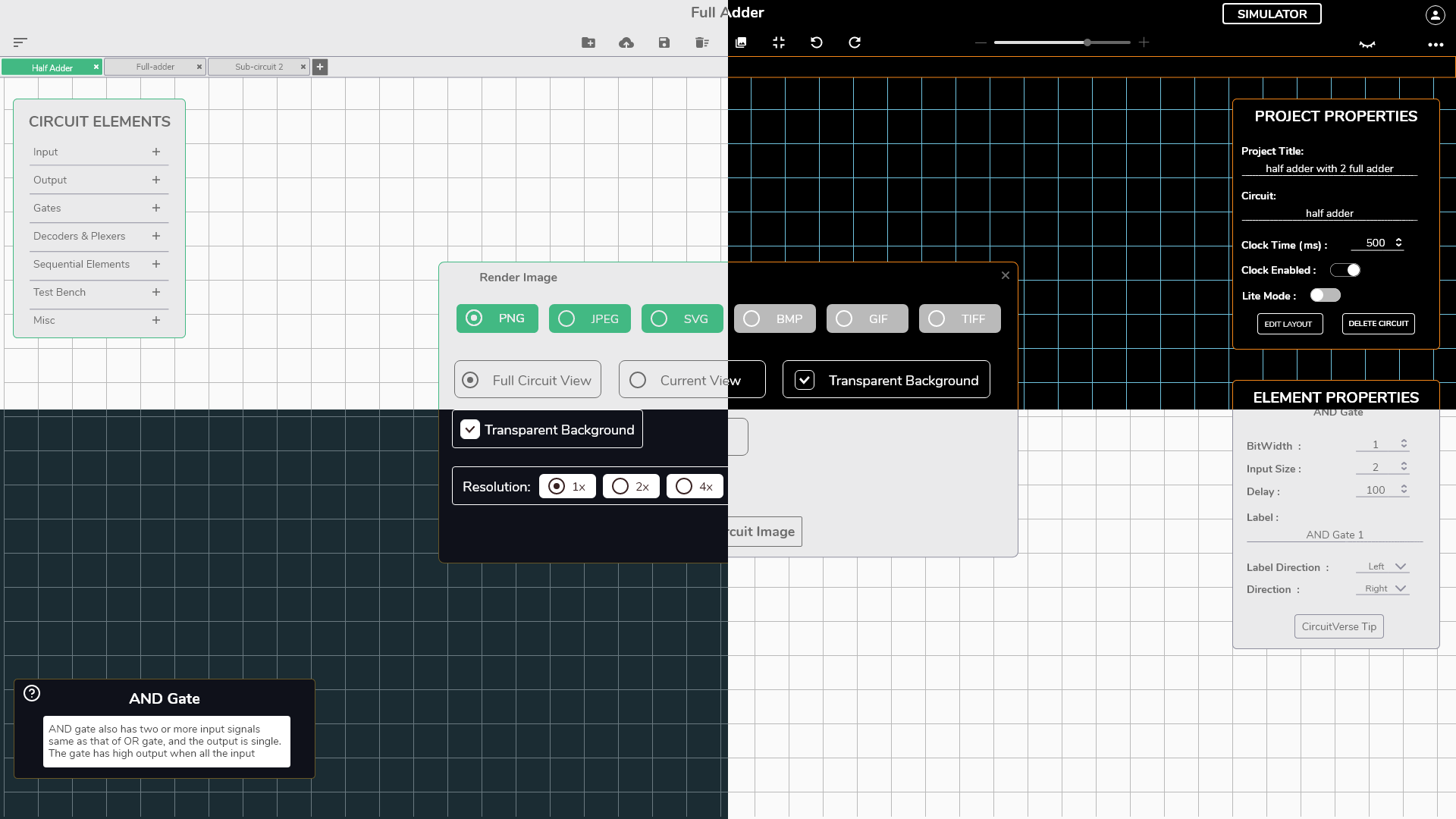
For a viewer what is seen must be something they’re comfortable with & visually appeals to them mainly. The creator uses some laws, such as color schema, color wheel, contrast ratio, to achieve them. So, after doing my homework I came up with 4 different themes on a designing tool (Adobe XD for me).
Named as:
- Night Sea
- Lite-Born Spring
- G&W (Grey & White)
- High Contrast (why not right?)
I named them based on what they resembled. The section preview is a quick snap of the 4 different themes.
Implementation:
The designing & researching part was done, now comes to the tough part.. coming to an end product as close to the design as possible. For the implementation, I didn’t want to complicate things, & tried to keep things as basic and native as possible.
After looking for ways to do this, & doing this right the way to achieve this, in a manner that doesn’t harm performance or requires the user to reload everything they switch between themes is to make use of the color variables, the native variable option that CSS provides.
Mixing this with some JS I was sure to have a working modal.
I start by separating the stylesheet rules that deal with colors, I extracted all those rules & created a new stylesheet with them so that the theme has to only deal with one sass file.
Secondly, change all the hardcoded hex codes into variables, having variables defined somewhere, at load these variables are defined to the root node of the DOM, then the page just extracts & sets these. Now, this was very important to change the theme in real-time, it’s possible to change the values of color variables present in the root with the help of JS w/o needing to reload.
Then, it was now time for some JS, defining the object with the theme name property and of course, their colors.
Made a panel to switch theme, generated the required functions, tested, & it was done with a total change of lines of code to the codebase: +3,165 addition & −2,406 deletion till now by this project.
PR Link: Color themes #1520

I can say I’m happy with the results, & if you’re reading this blog this I believe you have tested it out! please do comment if you like this feature, or even have anything to say, just do 😇. It’s not available in production yet but will be soon.
Project 2: Built-In tutorial

Overview:
Circuit Simulators are quite complicated applications, it gets very overwhelming for users new to the platform to get started, no one likes to read lengthy documentation just to try something out..& thus this project was inspired.
It was not that big of a task as built-in tutorials are a common thing on the web, & anything common surely has great libraries to get things done. There was a huge list of such libraries (provided by my mentor), I went through all of their docs, & decided to go with:
Driver.js by Kamran Ahmed.
Status: completed
Implementation:
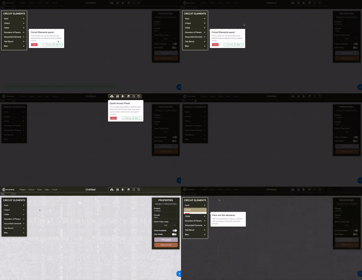
I read its documentation about usage & defined tour steps to visit every necessary element that needed a visit.
It required some changes to be made in the navbar, adding the newly added forum feature of the platform, & also adding the option to restart this tutorial whenever the user wants a re-tour.
It had an impact on the codebase with a total change of lines of code to the codebase: +161 addition & 0 deletion till now by this project.
PR Link: Built-in tutorials / getting started tutorials #1569
With this, I have completed the Second Phase evaluation, with just a few more weeks left for the completion of the GSoC program under the organization CiruitVerse.