Simulator Improvements: Phase 1 Report
Status: passed
This blog summarizes the work done for the second phase evaluation of Google Summer of Code program under the organization CircuitVerse as a part of the “Enhancing Simulator User Interface” project.
Project 1: Revamped User Interface (simulator)

Overview:
In a modern-looking world, having a modern-looking User Interface is now a trend, not just for the looks but many other things such as ease-of-use, accessibility, & proper browser support as well, hence this project was inspired.
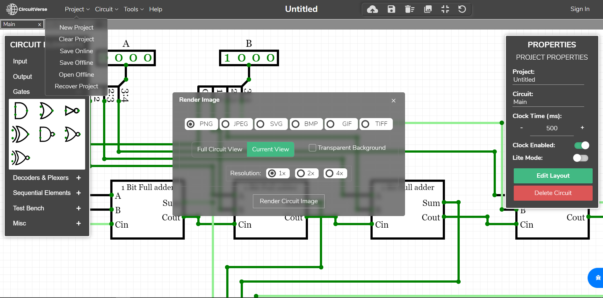
This User Interface breaks apart the side menu it previously had, transforming them into panels on either side of the viewport making the simulator ready to build circuits with all the tools right there on the screen. It also adds many custom design flavors, & there isn’t any element that hasn’t been touched by this project.
Status: completed
Description:
Designing a User Interface usually takes a lot of time, & looking at the current UI of CircuitVerse’s simulator I wanted it to have a new modern look. Thus, not thinking about anything else I had started making this prototype before even I submitted a proposal to the organization, not being even sure that I’d be selected or (the competition was quite tough).
Knowing this would be all a waste have I not gotten selected, but I decided to keep that thought aside & was able to have it complete before even community bonding had started. Though more effort was done to improve it after being selected most of the design work was done beforehand.
Implementation:
The proposed prototype is a complete custom re-design, no framework or library was used, but changing the default designs that the UI had initially. Only plain CSS3 with a few jQuery plugins were used to implement it. This User Interface tends to increase the visible workspace area by about 7.95% (estimated).
The project had initially begun with a design model which you can have a look at here: UI Preview Link
Then it was time to break apart the current UI elements, starting from the navbar & transforming it into the new UI. Which I found would be the best way to go, bringing in less break & very little chance of breaking anything.
and finally, after writing more than a thousand lines of CSS alone, everything now had the new UI with a total change of lines of code to the codebase: +5,319 addition & −1,365 deletion till now by this project.
PR Link: Revamp UI of the Simulator [Task 1.1.1] #1438
Project 2: Hotkey

Overview:
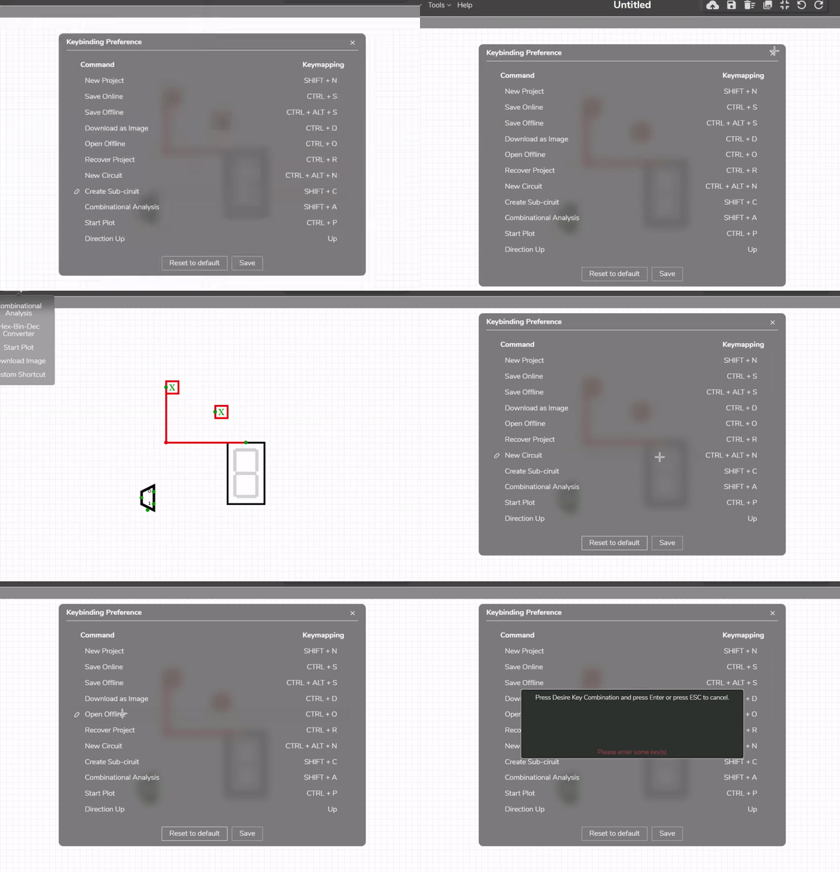
The Simulator of CircuitVerse like any other application requires users to use tools many times, and having a shortcut for frequently used tools in an application is considered a common convention since always. Isn’t it a pain to do the same steps just to get something every time someone wants to use that something? and that’s why this project was inspired.
As much as someone looks at the codebase & thinks about integrating this feature, it can be realized it’s quite a bit tricky.
Status: completed
Implementation:
I could not have a working modal robust enough to function properly without the help of a few libraries, this kind of feature is complicated on its own & there aren’t many libraries that could solve this. Fortunately, I came across a library whose objective is to bring shortcuts for any web-based application.
Handling Keyboard Shortcuts in JavaScript by Binny V A
but this library alone wasn’t enough to have an end product that is robust enough for the Simulator, when we think about cross-browser compatibility, there’s potential for this to break. So, integrating this library with another one that deals with cross-browser key events, it was possible to have a robust feature that work’s just fine.
Cross-browser normalization of keyboard events by Jonathan Tang
with just a total change of lines of code to the codebase: +1,424 addition & −85 deletion.
PR Link: Hotkeys [Task 1.2] #1475
With this, I have completed the First Phase evaluation, of the GSoC program under the organization CiruitVerse.